Donor Management System
Within the Reports Tab, you will be able to generate certain Custom Reports in Bar Chart and Pie Chart form.
Learn more:
Considerations
You can only generate Charts for the following Summarized Reports:
- Contribution Summary Report
- SYBUNT Report
- Extended Contribution Summary Report
- Mail Bounce Report
- Mail Summary Report
- Mail Opened Report
- Mail Click-Through Report
Adding a Chart to a Report
- In the Reports Tab, select New Report
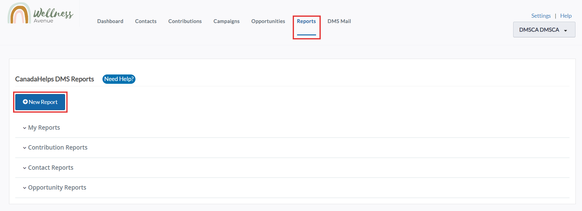 Reports > New Report
2. Select your desired Report Template section to expand all of the available Report Templates associated with the section.
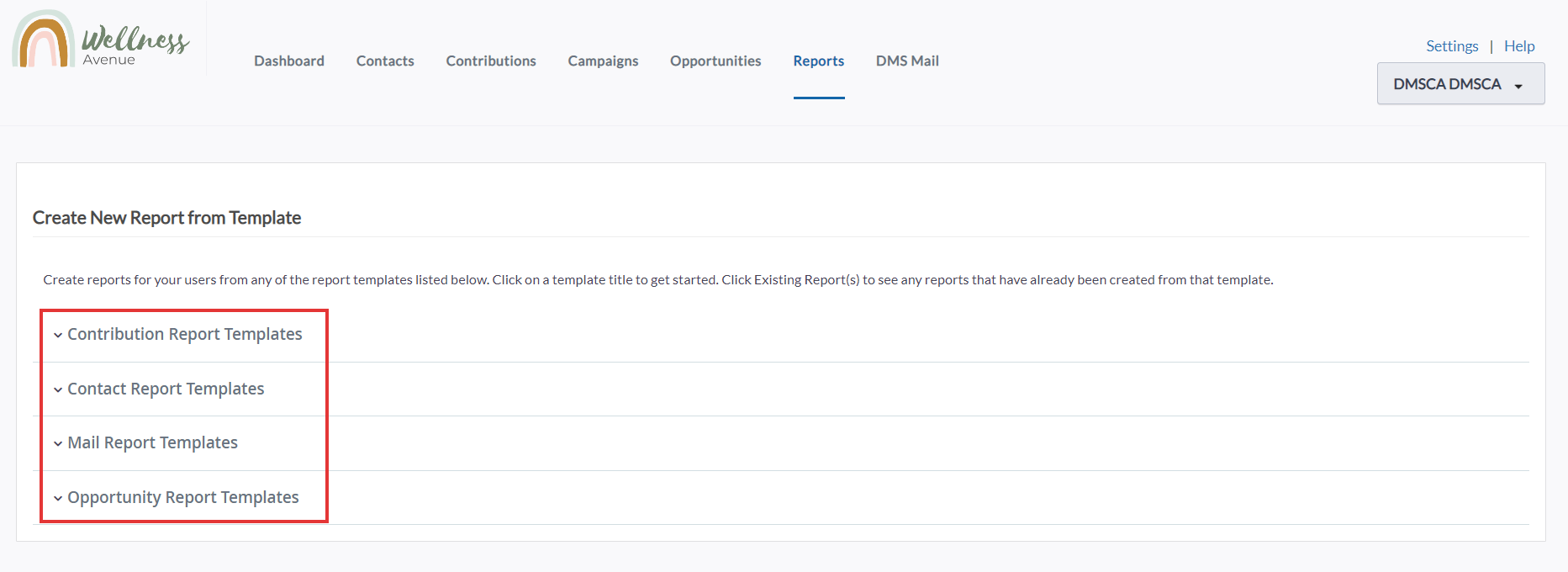 New Reports from template
3. Select from one of the New Reports mentioned above (see: Considerations)
 Select from one of the applicable New Reports
4. Within your selected Report Template, you can modify Columns to change the type of information you will view in your Chart:
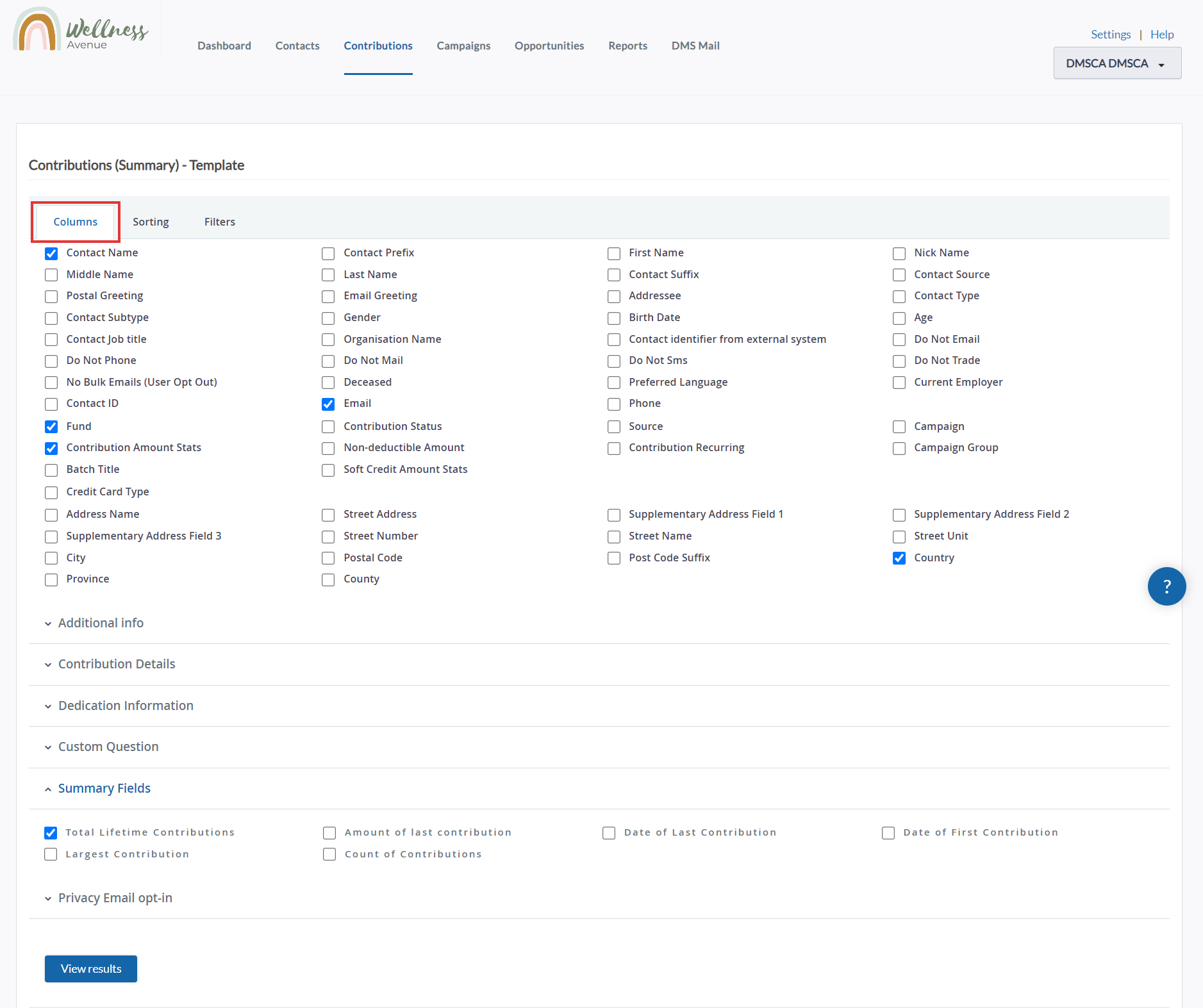 Choose your Report columns
5. In addition, you can modify:
- Filters (i.e. filter by This Fiscal Year):
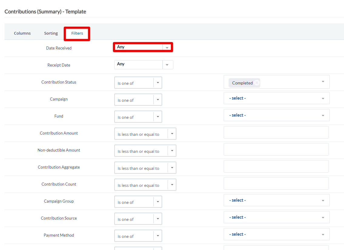 Reports Date Filter
- and Sorting (i.e. sort by Ascending order):
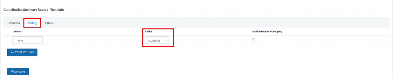 Sort in Ascending Order
6. Next, select View Results and you will automatically be taken to the standard Tabular Chart, segmented by the Columns you have selected.
 Report in Tabular mode
7. To view a Bar Chart or Pie Chart, select your desired Chart view from the drop-down menu and select View.
- Summary information will be displayed beneath the Chart, including Total Amount, Total Contributions, and Average Contribution.
Note: This Chart has been filtered by Date Received: This Fiscal Year.
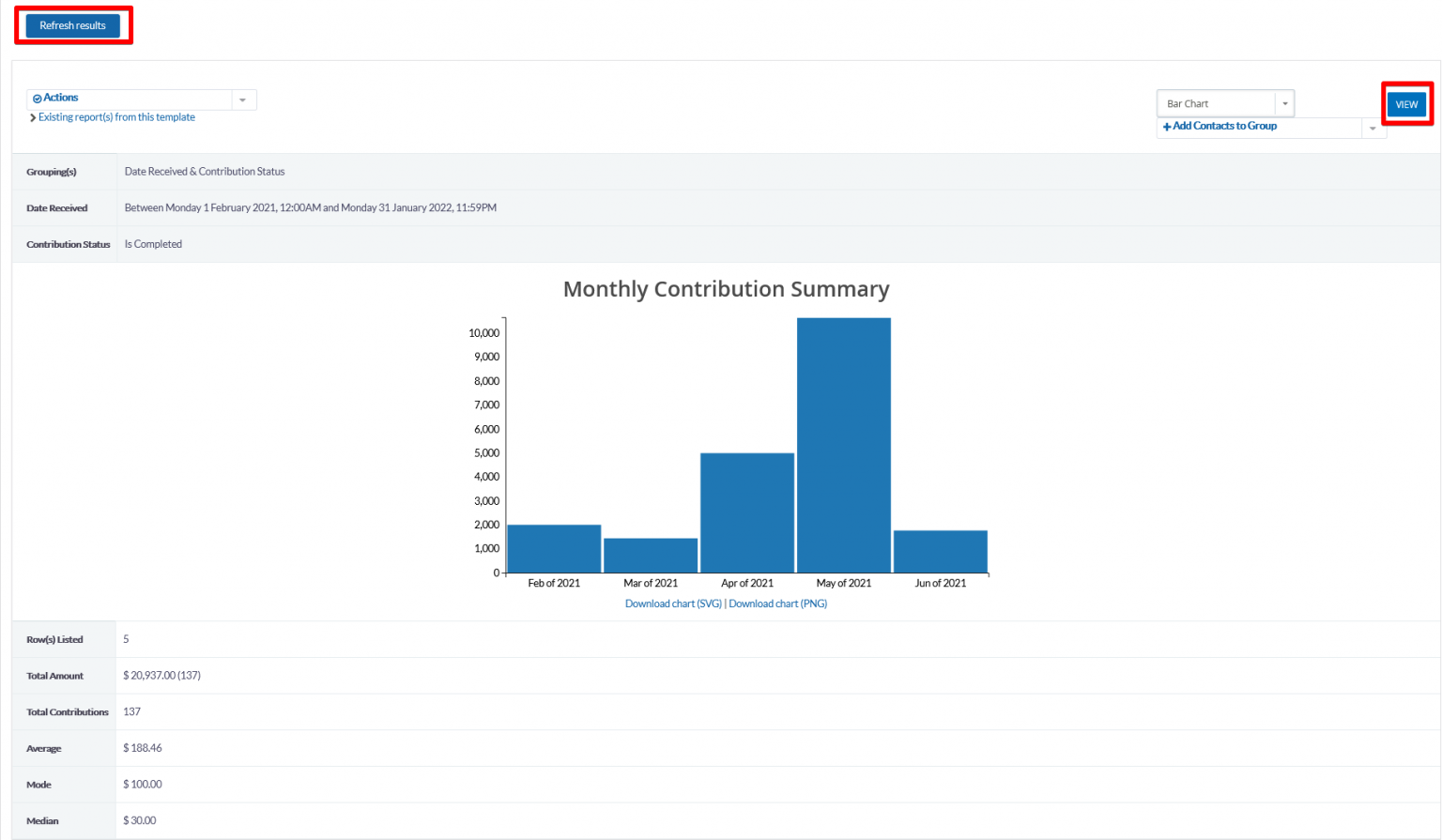
Note: This Chart has been filtered by Date Received: This Fiscal Year.
8. Now that you have generated your preferred Chart, you can perform a set of Actions, including:
- Create Report
- Save a Copy
- Print Report
- Export as .csv File
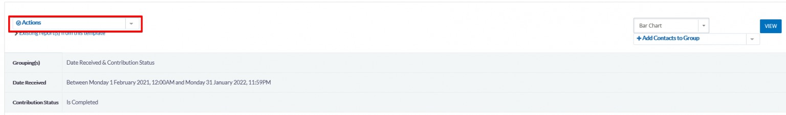 Actions
9. You will also be able to save this report to your Home Tab as a customized Dashlet.